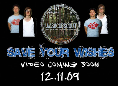
with this postcard we wanted to incorporate the release date, a font which highlighted the name of the single and more importantly announce that a video would be coming out soon. the postcard shows the band members in a bold stance, with a direct gaze at the camera. thanks to jodis editing she was able to dimmer the image and then place the band member behind the other, showing them as a close group. the band logo is also placed in the middle, and this has been following the rule of thirds, and adds to the visual hierarchy. placed on a black background makes everything easy to see, and combining large font with small font, different fonts, as well as pictures and edited ones, we feel this is a good advertisement and a well produced teaser postcard.
No response to “Postcard”
Leave a reply