
magazine production
the image is then the main point, in the top half and middle of the advert. it shows damien and bobby standing in the woods. towards the lower right hand corner is the release date. this gives the reader a clear indication of when the album is available for purchase. after this we have a review by NME magazine. we chose them to be our reviewers as we feel the music they review is of a simular style to the band, unlike kerrrang for example who are known for reviewing metal and hard rock music.
we then have the websites and programmes which are available for download, i tunes and amazon.com.
we then have our record company, sony music, followed by the official website and myspace.
we feel we have covered all aspects of our magazine which will visually please the reader, praise the album with a good review, a release date, website information and where it can be purchased. we shall be taking a screen shot of the advert before finishing.
Magazine Ideas
Wednesday, 25 November 2009
Screen Shot Of DigiPack
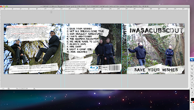
we have used a masking tape effect to place underneath our text and for the album title, the band title and all our text. this is a neutral colour between the green and brown backgrounds and the black text. we feel it really brings out the text and is clearly visible to the buyer. we have followed connotations of what a digipack should have and have used sound companies such as dolby, dvd specialists (blu-ray) by sony, and we are going to have our record company as sony records, this will help to endorse the album as is a major label, and is also the company who introduced blu-ray. the 3 images have been edited to adjust the lighting, and so it does not stand out too much or is so light that images arent easily recognizable.
here is a screen shot
Evaluation
Album Cover
Back Of Cd/ Tracklist/Barcode/BluRay/Production Company/Music Company


Artist/Production/Team Credits/Website(s)
Magazine Advert

Pictures For Digipack And Magazine Advert
Monday, 23 November 2009
digipack

Thursday, 19 November 2009
Digipack Planning
some general ideas that we had for an image based on the band and the album title were to use a simular concept with a forest scene. this relates to the band name as cub scouts are renowned for camping out in the forest. with regards to the album title, when someone 'makes a wish', it is stereotypical to look to the skys, asking for a higher power to grant it. we want to have the band looking up towards the sky, as if they were making a wish.
based on the position of the band and there gaze, we will place the band logo where there eyes are staring towards. we want to have one member sitting down and one member standing up, to make the pose look natural and not choreographed. a relaxed stance from the band gives a welcoming feel to the image. the way in which the photo is taken for our cover will follow the rule of thirds, and add to visual hierarchy. we aim to have a colour theme of text and imagery to be simular to the image, and the clothes the band wear will be incorporated with the theme also.
Digipack Research
Digipaks typically consist of a gatefold (book-style) paperboard or card stock outer binding, with one or more plastic trays capable of holding a CD or DVD attached to the inside. Since Digipaks were among the first alternatives to jewel cases to be used by major record companies, and because there is no other common name for Digipak-style packaging made by other companies, the term digipak or Digi-Pak is often used generically, even when the media holder is a hub or "Soft Spot"rather than a full plastic tray.
looking at google images and searching for other digipacks on todays market, we found some examples that we liked, and some that not nessecarily we liked the idea of, but were succesful digipacks and got good reviews. this way we can pick up ideas which work in terms of producing a good digipack.
 This album cover is good because it incorporates a natural feel, a relaxed feel, and is a shot of a simular surrounding in which we want to photograph our band.
the rule of thirds is followed here and we want to stick to that outlay of our cover.
Another example is the album Noble Beast by Andrew Bird.

the cover is simple yet stands out and is relaxed and visually pleasing on the eyes. it is another woodland forest type image and although there are no band members or band logos we feel it is original yet hardhitting, and hopeuflly we can transfer some of that into our cover.
.
Tuesday, 17 November 2009
GROUP 53 FINISHED MUSIC VIDEO
Q3-53 MUSIC VIDEO 2009 from SATMEDIASTUDIES on Vimeo.
Monday, 16 November 2009
shots from final cut (5)
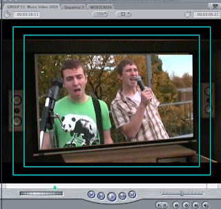
this shot is also in seven oaks sound and vision, but we have made it seem as if it is jodis house. it shows the band on a big projecter screen, and shows the band performing. this is a good shot as it then cuts to jodi sitting down with a tv remote in her hand, then quickly again to the screen.
shots from final cut (4)
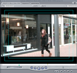 this shot is on location in cambridge, at sevenoaks sound and vision, burleigh street. we have again used the superimposement of the band onto a tv screen, and again jodi who plays the girl in love is completely unawares. soon after this tracking shot, damien emerges from the shop and walks behind her, singing to her.
shots from final cut (3)
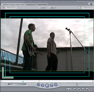
this is a low angle shot, also on location in Cambridge. it shows bobby and damien from a different angle, and we have used this angled shot to give the audience a feel as if they were there, and the band are performing live. lots of live shows or videos which include live footage have these angles, or ones similar. it shows the band higher up, giving them a sense of power and status. the audience are lower down, looking up to the band whom they have come to see and enjoy seeing. this shot gives the video this element and highlights the importance of the band.
shots from final cut (2)
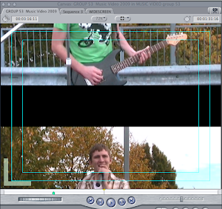
this shot is shortly after our opening clip. it is damien and bobby singing on location in cambridge. we have used medium shots, close ups and extreme close ups as well as one or two long shots. the transition between these shots we have given a 'push slide' effect. this gives the shot a clear transition and adds variety to the footage.
shots from final cut
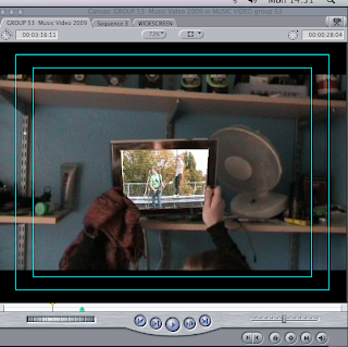
This shot is at the start of the video. the clip shows jodi awakening as light shines into the room, she checks her phone then reaches for the photo frame. the fact she has done this after checking her phone, means something to do with the band ie a text or a photo. this is where we have superimposed band footage to bring the photo frame to life, as the band starts to sing the transition is made from this footage to the band footage as they start to sing. we feel this is a good opening shot as it includes narrative and band footage, and a good technique.
Screen shots from editing of final footage

Wednesday, 11 November 2009
Evaluation of Editing second filming.
Tuesday, 10 November 2009
adding footage
Sunday, 8 November 2009
Feedback On Second Filming Session
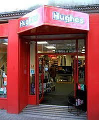
After filming here, we moved into the grafton centre to do some more filming of narrative. sticking to the theme of the singer being close to the girl with out her knowing, we thought it would good to catch her walking through a shopping centre whilst the singer is right behind her, singing to her. we were able to film this from a high angle which captures both characters nicely. these shots will be played during the verses to give the chorus a focus on the band. the footage was past a shop called republic. this is a high street chain which sells various brands and fashions which our target audience would watch. here is an image of the shop, which we walked past during our filming.
finally from town we all went to damiens house to film some more narrative. the starting clip of the video we planned to have jodi awakening and checking her phone, and then moving to a photo frame. we have captured this effectively and during editing we plan to emboss the band clip into the frame, following our idea of having images coming to life. we got long shots, medium shots, close ups and extreme close ups during this session, and we are all very pleased with what we captured.
We have decided as a group to stay in college on tuesday to edit the filming, and sync it with the track. we feel doing so will give us a lot of valuble time to make sure our editing and transitions, combined with variation of shots and band narrative crossovers are as professional as music videos we see today.
thank you to seven oaks and the grafton centre for allowing us to film.
Wednesday, 4 November 2009
More Locations
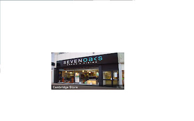
here is an image of shop we shall be using.
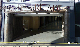
as well as a television shop, we will incorporate the fast paced hustle and bustle of the city centre, showing jodi walking through grand arcade whilst the lead singer is on the higher floor, she will be unawares of his presence following the theme of him being where she is at all times but with her totally oblivious to the fact that the person she is wanting and needed so much has always been right there with her. here is a shot of the place which we shall film in.
Monday, 2 November 2009
Feedback from class with regards to rough cut
Areas for improvement-add more variety of shots and small change in lip sync in a couple of lines of song.
What Could we change?-add a storyline , more locations and close ups
still to do- more shot variety, change the time of filming- add night time footage, progression through song.
as this is our rough cut we understand there are things to be done. we are however pleased with the comments we have recieved as we have already planned for our final footage to add more locations and more shots. the only thing we can tune up is the lip syncing and switch up the variety. jodi will be added to the footage and this will give us a narrative, thus resulting in more camera shots, different use of locations around cambridge and strengthen our video in a more professional manner. thanks to jodi for editing and the class for the feedback.


