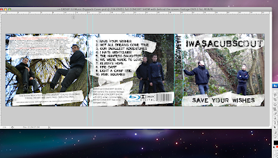
we have used a masking tape effect to place underneath our text and for the album title, the band title and all our text. this is a neutral colour between the green and brown backgrounds and the black text. we feel it really brings out the text and is clearly visible to the buyer. we have followed connotations of what a digipack should have and have used sound companies such as dolby, dvd specialists (blu-ray) by sony, and we are going to have our record company as sony records, this will help to endorse the album as is a major label, and is also the company who introduced blu-ray. the 3 images have been edited to adjust the lighting, and so it does not stand out too much or is so light that images arent easily recognizable.
here is a screen shot
No response to “Screen Shot Of DigiPack”
Leave a reply