NARRATIVE
GENRE
Thursday, 10 December 2009
Damien Crosby EVALUATION
Damien Crosby
In what ways does your media product use, develop or challenge forms and conventions of real media products?
1.During the process of our project, we wanted to make sure we covered aspects of music videos similar to today’s industry. We started off by analyzing the lyrics to the song, and seeing how we could incorporate them into a narrative for our video. We came up with the idea that the lyrics were representing a girl who has broken up with her boyfriend, and is regretting letting him go. She cannot get him out of her head, and this is reflected in the video in the way that as she carries out a normal day, the boy is there with her as she subconsciously thinks about him. The links between music lyrics, visuals and narrative, is strongly based on Andrew Goodwins ‘How to analyze a music video’. In this book he talks of 6 major points which music videos use to successfully sell a music video as a media product. The way in which we have created links between visuals and narrative shows we have conformed to his analysis, helping our video to be as professional as it can possibly be. During the narrative, the lead singer follows her during the day, and various shots in different scenes highlight this narrative. Once we had the narrative, we set about to shoot the video in a way which would please our record company, and sell our band successfully as an institution. The clothes we wore and the scenery in which the video was shot reflects this, as we dressed to suit the genre of our band, and shot in places which gave a reflection of our band, such as woodland scenery, and the town centre to give us a modern upbeat image as well as relaxed and laidback. The music genre which our band conformed to, is a hybrid of ‘indie’/’pop rock’. Once we had the initial idea for our video, we looked for other videos in today’s market which had a similar style or used similar effects and conventions of ours. We discovered three videos which done this, the first being ‘Bowling For Soup- Girl All The Bad Guys Want’. (2002) The inter-textual reference from this video refers to the superimposement of the band on television screens. Whilst the shot is in motion, the band appear to be performing on the television also. This effect we feel is a professional one and gives our video the ‘wow’ factor, in terms of the effects used. And we have used this shot in our video when Jodi walks past a television shop, and the band are performing on the television. Another video which we found to be inter-textually referenced from ours is ‘Fountains of Wayne- Stacey’s Mom’(2003). This video refers to the way in which the girl in our narrative sees the superimposement of the band, by sitting down watching the television and the band appears on the TV. The third and last video we felt was similar to ours was ‘Wyclef Jean- Gone Till November’(1998). this reflects the idea of the singer following a girl during the video, and adding to the narrative. To successfully shoot the video to high standards we focused largely on camerawork, and how the camera was used to highlight the band as an image, to vary shots to show pace and keep the audience entertained, and to give a certain feel to our video. A pan shot of the band performing was a handheld shot and gives a natural feel to the shot, panning in sync with the music. Tracking shots were also used, as well as long shots combined with close ups and extreme long shots. The lighting we used during the project was mainly natural, only indoor shots used electrical lighting. We chose to use mainly natural light as the band give across a very natural rural image, and having a woodland scene as a previous album cover gave us the inspiration to follow this style when filming. Another way in which our product developed and used real media products was in the production of our DigiPak. Using the rule of thirds, We stuck again to a natural chilled style, and used a shot of the band in the woodlands as our image. The font is black and bold so stands out well to the buyer, and is laid on top of a masking tape effect. The masking tape effect we felt was a good one as it is a representation of the bands name. ‘I Was A Cub Scout.” It links to this in the way that masking tape gives the idea of school and the bands name also suggests a young image. Once our digipack was completed we focused on our magazine advert and how the conventions of these were followed globally across the media and advertising industry. We stuck to using the band in the image to sell them to the buyer, having the title of the product we were advertising, and combined these with institutional information such as using ‘I Tunes’ and ‘Amazon’, which are online sites and reflect today’s market in the download and online purchasing industry. Also general conventions such as barcodes, as well as a release date and band websites for information and to build popularity. We also have used a quote from a review by ‘NME’ magazine, and we have chosen NME as they interview and review similar bands with similar genres. To combine this with the review, a five star rating has been used to furthermore advertise our album as one you will need in your record collection.
How effective is the combination of your main product and ancillary texts?
As a combination the main product as ancillary texts worked well to produce a positive effect, as the magazine and digipak combine to really advertise and sell the bands image. The natural feel relates and helps put the band across s celebrities who are not affected by fame, and stay down to earth, unlike what some critics portray celebrities as power mad and fake. The name of the band ‘I Was A Cub Scout’ refers to young/childish memories and thoughts, so when the masking tape effect is used in our digpak and magazine, a schooltime feel was embedded into our texts to reflect the bands childish happy side. To combine this text and attitude with a natural laidback image, we went into a woodland area to take our photos for the texts. This puts the band across as those who are honest and real artists, and this is backed up by the fact that the songs are written by the band as well as the instruments being played. This we feel puts the audience in a state that they see the band as genuine and a change from the powerhungry, musicians whose voices are studio modified, do not know how to play instruments and are in the music industry for other reasons than to play, enjoy and love music.
What have you learnt from your audience feedback?
To gather our feedback we asked fellow members of the class what strengths and weaknesses our project had. As only the rough cut was completed, many said that a narrative was needed. However we had already planned to include a narrative, but it was yet to be shot. The use of more locations was mentioned, so we took this into account and went to a TV shop, a shopping centre, a bedroom, and a town scene as well as a car park. We feel the use of different locations was effectively used and we are glad the idea was mentioned. The result of us doing so gathered a lot more positive feedback and using feedback slips we saw that there was not much else needed to do, as we had covered many aspects already. We decided to add more camera shots, and show progression through the song between the band footage and the narrative. We are pleased with the feedback we received, as well as the feedback from our teacher. He said that our footage was good and the effects we were using were good, as well as the digipak and magazine being very professional. Without this feedback we would have been unable to see our project from a analytical perspective, and would have been unable to adjust it accordingly to ensure it was to the best of our ability.
How did you use new media technologies in the construction and research, planning and evaluation stages?
We used various media technologies for the research, planning, construction and evaluation of our final product. For our planning, we wanted to understand the bands views and who they were as people. To do this we decided to email I was a cub scout using Myspace. Unfortunately we were unable to receive a reply as the band sadly split up in late 2007. In our research stages, Youtube was a big influence as we were able to easily search videos and watch them online, to help us understand techniques and ways in which the video was shot. As well as this related videos gave us a number of videos which were either by the same band, or were of a similar genre and style. In terms of the construction stage, using the Macs we were able to use final cut express for all our editing work. Using this we were able to add effects and make sure our work was in sync and professional. For our digipak and magazine, we used photoshop to edit our imagery, select our fonts and use effects such as the masking tape to bring out the font on the image. Once the video was completed, myself and bobby participated in a ‘Band Interview’. During this interview, in a documentary style, we reflected on and answered these four questions. Jodi was the interviewer, as well as the one who filmed the footage. We took this footage and embedded images from our work onto it, as well as some shots form the video. This way as we were answering a question, the shot would play over our voices and give the viewer more understanding of what we set out to achieve.
Jodi Page's Music Video Evaluation
In what ways does your media product use, develop or challenge forms and conventions of real media products?
In our music video we have linked the song lyrics to our video by using a narrative. Andrew Goodwin writing in ‘Dancing in the Distraction Factory’ (Routledge 1992) states that music videos demonstrate genre characteristics and that there is a relationship between lyrics and visuals, these are two of the six points Goodwin feels is needed to successfully analyse a music video.
The narrative is of a girl thinking of the singer due to their previous breakup. Her emotions are all over the place and during the video the singer appears in locations with her to represent her subconscious thought. Our music video typifies the way a record company would want their artist to be portrayed, by trying to create a realistic and down to earth performance. The genre of our video is indie rock so we tried to present this via costume design, equipment and overall mise-en-scene, such as the location of the car park roof. In our video we have used a wide variations of camera shots from close-ups to long shot, this helps towards making the video much more varied and reduces the chance of the audience loosing interest in the video. To help with this we have also used still shots and panning to create movement and a point of interest in our video. In part on the video we created the look of a security camera, this was to add realism to the fact the singer was following the girl everywhere.
At the planning stage of our video we focused on 3 real music videos for inspirations towards the creation of our own storyboard for our video. The first video was by ‘Wyclef Jean – gone till November (1998)’ this video showed one woman’s regret in life about a man, and this man shows up a lot during her days. This influenced our idea of having the singer as the girls’ subconscious thoughts. The other two videos that played a big role in our storyboard were ‘Bowling for Soup – girl all the bad guys want (2002)’ and ‘Fountain of Wayne – Stacey’s Mom (2003)’. In both these videos they have super imposed footage onto an object, in these cases a television screen, of the band playing. We have used this in our final videos in scenes such as when the girl is looking at a photo frame, and also as she is walking past a shop, she is unaware that the band is playing on the TV screen in the shop window.
In our digipack cover we have used such features of barcodes, record labels, websites, production team and overall images of the band, this ensures our digipack is original and realistic to the audience. In our magazine advert we have included release dates, rating and reviews to provide the audience with key information.
How effective is the combination of your main product and ancillary texts?
In combinations with our main products and ancillary texts we have located images of the band into both our digipack and magazine advert, we used the same image to emphasize the photo and allows the audience to automatically define that photo to the band itself. On both our ancillary texts we have used a white masking tape overlay as a background for our text. This relates to the genre of the music and also allows the band to have a characteristic in all their products that people with remember and resemble that masking tape effect with the band. This all comes down to trying to pin point areas where we can guarantee the audience will remember their band etc. the images of the band on both ancillary texts are of woodlands scenes with the two bands member in them, the woodland scenes represent the name of the band ‘I was a cub scout’ as cub scouts are portrayed to generally be around a camp fire and our in the open etc.
What have you learned from your audience feedback?
Overall our feedback for our rough cut was to add more narrative, this was because our rough cut was just the basic footage of the band playing on the car park roof. However we took the advice onboard and filmed different locations of narrative. Feedback from our final video showed the class felt the techniques of super imposing were used well in our video. And also in our ancillary texts the use of the masking tape trademark was well presented. Negative feedback included that the photograph in our magazine advert came across slightly stretched, however the good points override the negative with most of the class saying the use of information and the attention to detail were really effective.
How did you use new media technologies in the construction and research, planning and evaluation stages?
During the planning stage we tried to contact the band for inspiration via facebook and myspace, however due to the splitting up of their band we did not get a reply. However we found even just trying to contact the band gave us a much-needed insight into the bands life and their background. Youtube allowed us to view previous music videos the band had produced and also to watch live performances. The programmes we used to construct and edit our video were final cut, for the overall construction and editing of the video. We used Photoshop for the digipack and magazine advert. Throughout the editing process we tried to blog all our work and add screen grabs of our work to explain and demonstrate our progress. To film our spoken evaluation we chose to have Damien and Bobby creating the roles as the two-band member with me as the interviewer, asking them the vital questions. In all our filming we used a standard digital video camera, and then a stills camera for the ancillary texts images.
Bobby Celentano's Music Video Evaluation
Bobby Celentano
IN WHICH WAYS DOES YOUR MUSIC PROUCT USE, DEVELOP OR CHANGE FORMS AND CONVENTIONS OF REAL MEDIA PRODUCTS?
1. Links have been made between the lyrics and the visuals in terms of the narrative. Andrew Goodwin states music videos demonstrate genre characteristics and there is a relationship between both lyrics and music, and visuals. These are two of his six points he feels are needed to successfully evaluate a music video. (“Dancing in the distraction factory” Routledge 1992). The ideas that the girl is regretting letting him go and now he doesn’t want her anymore, she can’t stop thinking about him. The overall idea was to represent him as in her subconscious, due to the fact she can’t stop thinking about him and this is why he shows up around her throughout the narrative. The music video helps to show the way in which a record company would want their artist to be represented by making them seem really down to earth, this is done using the outdoor scenery, trees, sky and also the images from the digi-pack and the magazine advert. The video represent the genre of indie/rock in the sense of clothing, as the artists are dressed in indie style clothing and also in the fact they play their own instruments puts across the rock style of the genre. We used a mixture of camera methods where we had the camera moving along with the character, for example the security camera style we used. Also still camera work was used in certain parts so as to see both the character and the artist move past the camera one after the other. In terms of mise-en-scene we used the private viewing room in the seven oaks store (with permission), a bedroom for the female character and also the roof top of a car park for the live performance. We got a few ideas from other music videos we had seen, which were not actually within our genre. Bowling for soup’s song “girl all the band guys want”(2002) gave us the idea of having the band on the T.V within the shop whilst the girl goes past, we did this by superimposing the footage onto secondary footage. Fountains of Wayne’s song “Stacy’s mom”(2003) gave us another idea, to actually have the girl watching the band on T.V whilst sat at home and this was also done by superimposing footage. The third idea came from Wyclef Jean’s song “Gone till November”(1998), this gave us the idea of having the artist follow the singer whilst singing but without her actually knowing. Our digi-pack is similar to other album covers as well as our magazine advert, as they both use the general conventions. For example the digi-pack used a barcode, production company logo, band as the main focus, names of songs, what’s on each of the cd’s/dvd’s and also band websites. The magazine advert used a release date, where the album will be available, an out of five rating, NME review, websites and also the picture of the band as the main focus to catch the viewers eye using the rule of thirds.
HOW EFFECTIVE IS THE COMBINATION OF YOUR MAIN PRODUCT AND ANCILLARY TEXTS?
2. As a combination the main product and ancillary texts were very effective, as the digi-pack and magazine advert really help to reflect the bands image. The idea of showing them as everyday people rather than hot shot celebs, and putting across to the audience that they are really down to earth, true artists. Also as the name of the band is ‘IWASACUBSCOUT’, it makes you think childish. Which brought us back to thoughts of school, and the idea of the writing was a result of this thought which helps to put across the bands childish side. Also the text used helps to show the genre of the band, due to the use of broken up styled text. To achieve the look, as a group we went out to take photos for our digi-pack where we included lots of woodland scenery, which we felt helped to put across how we are very natural and down to earth artists. It really just emphasised what we were trying to put across to the audience.
WHAT HAVE YOU LEARNED FROM YOUR AUDIENCE FEEDBACK?
3. From feedback we found that what many people enjoyed from our rough-cut was the live performance. It was said that we needed to add a narrative which we then did, and the use of more locations and shots which in turn we also did. The result of this was much more positive feedback and an overall better final product. From the feedback slips we received from other members of our class, we found that there wasn’t much we needed to change. We took on board any points people would want to see changed and it helped in terms of creating a successful final product. Its really about producing a product that appeals to the audience, and if we didn’t take into consideration their criticisms the product would not be a success.
HOW DID YOU USE NEW MEDIA TECHNOLOGIES IN THE CONSTRUCTION AND RESEARCH, PLANNING AND EVALUATION STAGES?
4. We used a number of media technologies in the construction, research, planning and evaluation of our final product. We used MySpace to try contact the band, which sadly failed due to them splitting up. YouTube was a big help in terms of us being able to view a number of the bands performances to add with our overall ideas. Final cut was used in the construction stage of the final product in terms of editing, and Photoshop was used to construct the digi-pack and magazine advert with the help of templates. Our work was all recorded on a digital camera which was then downloaded on to final cut on the Apple Mac computer, for the final editing stages. Once the music video was finished we moved on to creating the evaluation video, in which myself and Damien went back into our roles of ‘IWASACUBSCOUT’ to undergo an interview styled documentary answering these four questions. We shot the footage onto a digital camera then uploaded it onto final cut, after getting it in order we the took footage from our music video which we added so that we could show exactly what we were talking about to help give more understanding to the viewer.
Monday, 7 December 2009
Documentry
the questions we were asked were:
1. In what ways does your media product use, develop or challenge forms and conventions of real media products?
2. How effective is the combination of your main product and ancillary texts?
3. What have you learned from your audience feedback?
4. How did you use new media technologies in the construction and research, planning and evaluation stages?
Jodi was the interviewer, whilst Damien and Bobby were being interviewed, sticking to the role of us being the band members. we wanted the interview to highlight the band as fun, happy yet professional and dedicated musicians.
we covered the ways we developed and challenged media products by sticking to basic conventions of music videos, by highlighting ourselves as the band, and showing a narrative to our video related to the lyrics in the song. we also challenged forms of media products by what we wore in the video and how we acted to sell ourselves as an institution. when speaking of new technologies uses, final cut express and photoshop were mentioned as these were the main programmes used in our editing and creation of our video, magazine and digipack, as well as using youtube to research simular videos, google to search images of digipacks and blogger and myspace for research feedback and planning.
in terms of feedback we related to online feedback, such as looking on myspace etc and using the blog to full effect by going through our work step by step, and highlighting any changes or new ideas or challenges we came across during the process. we used class feedback during lessons to look at the strengths annd the weaknesses of our project, as well as feedback from the teacher.
finally we came onto our ancillary texts, such as our magazine advert and our digipack.
we said that our digipack was named after the song ' Save Your Wishes' and this gave us a foundation to build on. we said that it went to number 1 and because of this the album title would be recognised by the audience. we spoke about the fonts we used and the masking tape effect included on our digipack, as well as the live performance CD being the extra bonus which buyers recieved when purchasing our digipack. in terms of the magazine we spoke about the way in which we could advertise ourselves, give viewers a clear indication of where it was available to buy/download, and when it was available to do so.
we are currently working on the footage and editing it so we can produce a well edited and flowing interview, which is professional and covers the topics mentioned. will be uploaded when finished, and then evaluated for feedback.
magazine production
the image is then the main point, in the top half and middle of the advert. it shows damien and bobby standing in the woods. towards the lower right hand corner is the release date. this gives the reader a clear indication of when the album is available for purchase. after this we have a review by NME magazine. we chose them to be our reviewers as we feel the music they review is of a simular style to the band, unlike kerrrang for example who are known for reviewing metal and hard rock music.
we then have the websites and programmes which are available for download, i tunes and amazon.com.
we then have our record company, sony music, followed by the official website and myspace.
we feel we have covered all aspects of our magazine which will visually please the reader, praise the album with a good review, a release date, website information and where it can be purchased. we shall be taking a screen shot of the advert before finishing.
Magazine Ideas
Wednesday, 25 November 2009
Screen Shot Of DigiPack
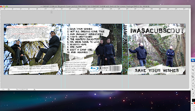
we have used a masking tape effect to place underneath our text and for the album title, the band title and all our text. this is a neutral colour between the green and brown backgrounds and the black text. we feel it really brings out the text and is clearly visible to the buyer. we have followed connotations of what a digipack should have and have used sound companies such as dolby, dvd specialists (blu-ray) by sony, and we are going to have our record company as sony records, this will help to endorse the album as is a major label, and is also the company who introduced blu-ray. the 3 images have been edited to adjust the lighting, and so it does not stand out too much or is so light that images arent easily recognizable.
here is a screen shot
Evaluation
Album Cover
Back Of Cd/ Tracklist/Barcode/BluRay/Production Company/Music Company


Artist/Production/Team Credits/Website(s)
Magazine Advert

Pictures For Digipack And Magazine Advert
Monday, 23 November 2009
digipack

Thursday, 19 November 2009
Digipack Planning
some general ideas that we had for an image based on the band and the album title were to use a simular concept with a forest scene. this relates to the band name as cub scouts are renowned for camping out in the forest. with regards to the album title, when someone 'makes a wish', it is stereotypical to look to the skys, asking for a higher power to grant it. we want to have the band looking up towards the sky, as if they were making a wish.
based on the position of the band and there gaze, we will place the band logo where there eyes are staring towards. we want to have one member sitting down and one member standing up, to make the pose look natural and not choreographed. a relaxed stance from the band gives a welcoming feel to the image. the way in which the photo is taken for our cover will follow the rule of thirds, and add to visual hierarchy. we aim to have a colour theme of text and imagery to be simular to the image, and the clothes the band wear will be incorporated with the theme also.
Digipack Research
Digipaks typically consist of a gatefold (book-style) paperboard or card stock outer binding, with one or more plastic trays capable of holding a CD or DVD attached to the inside. Since Digipaks were among the first alternatives to jewel cases to be used by major record companies, and because there is no other common name for Digipak-style packaging made by other companies, the term digipak or Digi-Pak is often used generically, even when the media holder is a hub or "Soft Spot"rather than a full plastic tray.
looking at google images and searching for other digipacks on todays market, we found some examples that we liked, and some that not nessecarily we liked the idea of, but were succesful digipacks and got good reviews. this way we can pick up ideas which work in terms of producing a good digipack.
 This album cover is good because it incorporates a natural feel, a relaxed feel, and is a shot of a simular surrounding in which we want to photograph our band.
the rule of thirds is followed here and we want to stick to that outlay of our cover.
Another example is the album Noble Beast by Andrew Bird.

the cover is simple yet stands out and is relaxed and visually pleasing on the eyes. it is another woodland forest type image and although there are no band members or band logos we feel it is original yet hardhitting, and hopeuflly we can transfer some of that into our cover.
.
Tuesday, 17 November 2009
GROUP 53 FINISHED MUSIC VIDEO
Q3-53 MUSIC VIDEO 2009 from SATMEDIASTUDIES on Vimeo.
Monday, 16 November 2009
shots from final cut (5)
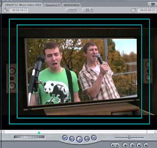
this shot is also in seven oaks sound and vision, but we have made it seem as if it is jodis house. it shows the band on a big projecter screen, and shows the band performing. this is a good shot as it then cuts to jodi sitting down with a tv remote in her hand, then quickly again to the screen.
shots from final cut (4)
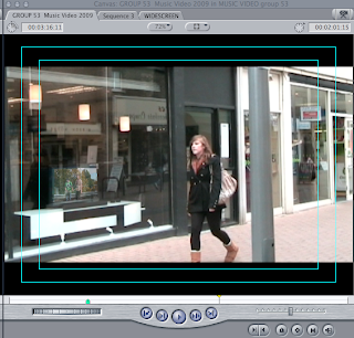 this shot is on location in cambridge, at sevenoaks sound and vision, burleigh street. we have again used the superimposement of the band onto a tv screen, and again jodi who plays the girl in love is completely unawares. soon after this tracking shot, damien emerges from the shop and walks behind her, singing to her.
shots from final cut (3)
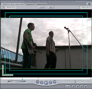
this is a low angle shot, also on location in Cambridge. it shows bobby and damien from a different angle, and we have used this angled shot to give the audience a feel as if they were there, and the band are performing live. lots of live shows or videos which include live footage have these angles, or ones similar. it shows the band higher up, giving them a sense of power and status. the audience are lower down, looking up to the band whom they have come to see and enjoy seeing. this shot gives the video this element and highlights the importance of the band.
shots from final cut (2)
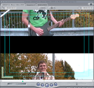
this shot is shortly after our opening clip. it is damien and bobby singing on location in cambridge. we have used medium shots, close ups and extreme close ups as well as one or two long shots. the transition between these shots we have given a 'push slide' effect. this gives the shot a clear transition and adds variety to the footage.
shots from final cut
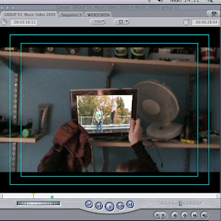
This shot is at the start of the video. the clip shows jodi awakening as light shines into the room, she checks her phone then reaches for the photo frame. the fact she has done this after checking her phone, means something to do with the band ie a text or a photo. this is where we have superimposed band footage to bring the photo frame to life, as the band starts to sing the transition is made from this footage to the band footage as they start to sing. we feel this is a good opening shot as it includes narrative and band footage, and a good technique.
Screen shots from editing of final footage

Wednesday, 11 November 2009
Evaluation of Editing second filming.
Tuesday, 10 November 2009
adding footage
Sunday, 8 November 2009
Feedback On Second Filming Session
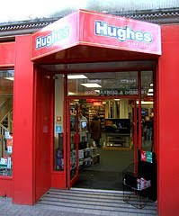
After filming here, we moved into the grafton centre to do some more filming of narrative. sticking to the theme of the singer being close to the girl with out her knowing, we thought it would good to catch her walking through a shopping centre whilst the singer is right behind her, singing to her. we were able to film this from a high angle which captures both characters nicely. these shots will be played during the verses to give the chorus a focus on the band. the footage was past a shop called republic. this is a high street chain which sells various brands and fashions which our target audience would watch. here is an image of the shop, which we walked past during our filming.
finally from town we all went to damiens house to film some more narrative. the starting clip of the video we planned to have jodi awakening and checking her phone, and then moving to a photo frame. we have captured this effectively and during editing we plan to emboss the band clip into the frame, following our idea of having images coming to life. we got long shots, medium shots, close ups and extreme close ups during this session, and we are all very pleased with what we captured.
We have decided as a group to stay in college on tuesday to edit the filming, and sync it with the track. we feel doing so will give us a lot of valuble time to make sure our editing and transitions, combined with variation of shots and band narrative crossovers are as professional as music videos we see today.
thank you to seven oaks and the grafton centre for allowing us to film.
Wednesday, 4 November 2009
More Locations
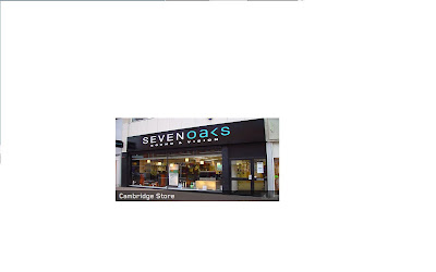
here is an image of shop we shall be using.
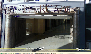
as well as a television shop, we will incorporate the fast paced hustle and bustle of the city centre, showing jodi walking through grand arcade whilst the lead singer is on the higher floor, she will be unawares of his presence following the theme of him being where she is at all times but with her totally oblivious to the fact that the person she is wanting and needed so much has always been right there with her. here is a shot of the place which we shall film in.
Monday, 2 November 2009
Feedback from class with regards to rough cut
Areas for improvement-add more variety of shots and small change in lip sync in a couple of lines of song.
What Could we change?-add a storyline , more locations and close ups
still to do- more shot variety, change the time of filming- add night time footage, progression through song.
as this is our rough cut we understand there are things to be done. we are however pleased with the comments we have recieved as we have already planned for our final footage to add more locations and more shots. the only thing we can tune up is the lip syncing and switch up the variety. jodi will be added to the footage and this will give us a narrative, thus resulting in more camera shots, different use of locations around cambridge and strengthen our video in a more professional manner. thanks to jodi for editing and the class for the feedback.
Thursday, 22 October 2009
from rough cut to final video. What needs to be done.
GROUP 53 Music Video 2009 ROUGHCUT from SATMEDIASTUDIES on Vimeo.
Our rough cut is very simple compared to our actual final idea for the music video. however we have brought together all the band footage that we need for our final video. we still have the following to do before the final deadline:
- Story based/narrative filming
- final editing of video
- production logo
Wednesday, 21 October 2009
Rough Cut screen grab
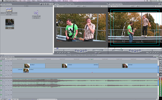 Here is a screen grab of part of our rough cut in editing in final cut. our rough cut consists of the footage of the band performing. we have used this as our rough cut only as our final idea is to consist of a narrotive section in which it tell a story, the band footage will appear frequently throughout the video.
Roughcut Evaluation
Monday, 19 October 2009
Filming Stage 1- feedback
this is a shot from google map of the area where we filmed.

Wednesday, 14 October 2009
Filming Stage 1
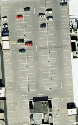
today we gathered our equipment and set out to film our bands performance. unfortunately the cervical cancer jabs are taking place in the main hall and for privacy reasons we were unable to walk through to film. given this, we had nowere else to film. so we have decided to come back into the classroom, and plan where to film. thanks to stu we are able to use a guitar for our filming, and we have deciced our location to be the car park adjacent to the grafton. there is alot of graffiti work which would appeal to teenagers as its rebellious and reflects a stereotype given to them by society. however in the video we want to percieve it as an art rather than a crime. the high up view will give a view of buildings in the background, and will not take away focus from the band. we will film multiple shots of the song and this will give us a vast catalogue of shots to include in our final piece. heere is a screen shot of where we will be filming.
Tuesday, 6 October 2009
ED LOVELACE - TALK IN THE HALL - WEDNESDAY 7.10.09
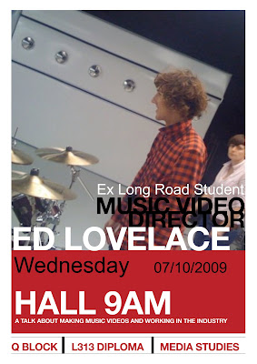
Former Long Road Media student Ed Lovelace will be talking about his music videos and career path into the film industry.
Please remember to take notes on the talk and the videos discussed - In the next lesson you will be writing up the talk on your blogs and from YouTube adding the videos he will be showing in his presentation.
'Ain't No Rest For The Wicked' - Cage The Elephant
'In One Ear' - Cage The Elephant
'Abandon Ship' - Gallows
'Laser Hannon' - Cutting Pink With Knives
Monday, 5 October 2009
more ideas
Wednesday, 30 September 2009
Live Music Video- Pulled From Youtube
Postcard
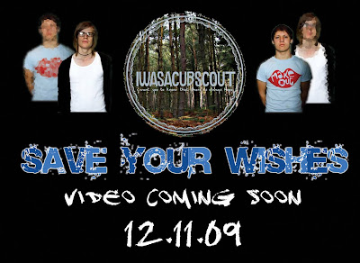
with this postcard we wanted to incorporate the release date, a font which highlighted the name of the single and more importantly announce that a video would be coming out soon. the postcard shows the band members in a bold stance, with a direct gaze at the camera. thanks to jodis editing she was able to dimmer the image and then place the band member behind the other, showing them as a close group. the band logo is also placed in the middle, and this has been following the rule of thirds, and adds to the visual hierarchy. placed on a black background makes everything easy to see, and combining large font with small font, different fonts, as well as pictures and edited ones, we feel this is a good advertisement and a well produced teaser postcard.
Research on Band
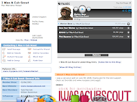
this is a screen grab from the bands myspace. unfortunatley the band are no longer together and split up in 2007. however the music is still appreciated and listened to.
More ideas
in college (on the field, in the studio, and the hall)
outside college ( town centre, a bedroom, burleigh street)
these locations could be changed but this is our initial idea to where we want to film.
Monday, 28 September 2009
Story board Timeline

Save your wishes by I was a cub scout is 3minutes and 11seconds in length. The beginning instrumental lasts 32seconds, we need to use this time effectively to catch the viewers attention and also start narrating the story line of our video. The next section contains the first verse of lyrics this goes on to 1minute 15 seconds.
Throughout the song short instrumentals are played which give us more time to narrate the storyline. the chorus is repeated 3 times during the song.
SAVE YOUR WISHES - I was a cub scout
Whatever you want,
Wherever you are,
Whatever you need,
I'm not that far.
Your a riddle that i'm hoping to solve soon
I cannot let my plans fall through,
And I'm a little worried about it all.
There's no boundaries to what you could be capable of,
Is there anything else left to go wrong?
Is there anything else left to go wrong?
Save your wishes,
Cause they won't help you.
And keep your kisses,
Cause they're unwanted.
Short lived,
Not even a chance to slap.
Leave the brave or bar, it's meant nothing to anyone.
So I cross my fingers and I was replaced,
I was bought for a price and then...
Now back to back,
When you're who we are,
We mean nothing to anyone.
Save your wishes,
As they won't help you.
And keep your kisses,
As they're unwanted.
Save your wishes,
As they won't help you.
And keep your kisses,
As they're unwanted.
Thursday, 24 September 2009
Moodboard
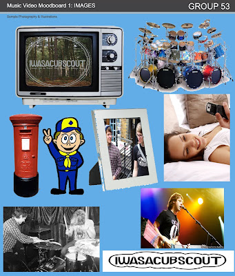
Our mood board represents various ideas incorporated with our initial ideas in correspondence with our music video. All the pictures used relate to the ideas posted on our blog and also photos of the artists themselves 'i was a cub scout'.
We embedded 2 photos of the artists and their band name into the photo frame and television screen, as this is a technique we intend to use during our music video.
Wednesday, 23 September 2009
Music Video Pitch- (initial ideas) DRAFT
Various camera shots and zooms
a narrative
Band Exposure
various locations to shoot
advanced techniques such as embedding images, and make sure simple things such as transitions and cuts are combined with harder techniques such as adding special effects and timing our editing to perfection, in order to make our video look as professional as possible.
Here is our initial idea of what we want our music video to be.
Song starts, first scene is a girls bedroom. girl awakes as the song starts to play and she immediately moves towards a photograph. the camera follows her movement and reveals the photo she is holding is of the band. she smiles, looks over to an empty side of the bed and frowns. she gets up and turns on the tv, and walks to the bathroom. the camera pans around her walking away, to the band playing on the Tv. the camera then zooms in towards the Tv and a transition is made through the Tv to where the band are actually performing. pans and cuts between the band then follow and the singing begins. whilst singing lots of close ups of vocals and instruments are needed to highlight the band and sell them as an image. whilst the video unfolds, a narrative emerges that this girl is in love with the lead singer, but as she tries to sort herself out so she can be with him, he is always there and she is the only one unaware to this. the next time the girl is on camera she is in a town center, and walks past a tv shop, and double takes at the shop to see the band playing on all of the televisions. she scurries away and the camera holds to show the band emerge from the shop, singing to her as she flees the scene.
The key ideas of this video is that the band is always with and around the girl, subconsious to the girl but not everyone else. for example whilst she is sitting at the bottom of a hill, the band are at the top of it and people around notice but she does not. another key idea is using objects to embed a shot or a clip from our filming, for example seeing it a pint of beer. these techniques will really make our video stand out. we also need to make sure out target audience is appealed to, so the dress code will be as fashionable as possible, and we will include everyday tasks such as being at college, being in and around town and enjoying leisure's with friends. as the song progresses, the girl becomes more and more emotional over her love for the singer. she ends up going to a party, completely unaware that the badn are performing. she sees the band, and they make eye contact, but he immediately looks away. she feels hurt and abandoned and heads for the nearest shot of alcohol.
To try and put our videos into context, we looked at videos that were on the internet to try and give our video something to compare to, using simular techniques. one that we found that incorporated our idea of tv's showing the band is a rock/pop song by Bowling For Soup, entitled Girl All The Bad Guys Want.
As well as techniques, we wanted to find a video which had a similar narrative behind it. after watching many videos we found one which we thought fits a similar story. it is a similar genre of music and it is by a well known British band, The Kooks. song entitled Naive.
http://www.youtube.com/watch?v=TQbipvfWaR4 NOTE: No embed was found for this video.
Both these songs include ideas which are simular to ours. the bowling for soup shows interaction between a girl and the band, and embedding filming through an object, being the televisions. the kooks song shows the band member as the narrative, which is the opposite to ours, but the narrative is simular. looking for someone who is lost and showing emotions with close ups and including real life scenarios i.e being in a nightclub, being with friends and partaking in pastimes.


